Accessible Website Design in 2026: 7 Live Checks for Structure, Forms, and Privacy UX
The real value in accessible website design shows up when you debug it like a live system. A banner can render perfectly and still leak requests, misfire tags, or drift after the next plugin or theme update.
The useful test for accessible website design is whether the live stack behaves correctly before consent, after consent, and after the next deployment. That is how hidden leaks and timing mistakes show up.
ADA.gov still says businesses open to the public must provide “full and equal enjoyment” of their goods and services, including when those services are delivered online. The Department of Justice also still highlights the same practical failure points in inaccessible sites: missing alt text, videos without captions, forms without “Labels” or “Clear instructions,” and mouse-only navigation. W3C’s current accessibility principles still say all functionality should be available from a keyboard, “Keyboard focus does not get trapped,” and “The keyboard focus is visible.” And W3C’s WCAG 2.2 Recommendation still says teams should “adopt WCAG 2.2 as their new conformance target” even when formal obligations mention older versions.
That is the right frame for accessible website design in late 2026. It is not mainly about decoration, overlays, or one compliance sprint. It is about whether the real journeys on the live site are understandable, operable, and resilient when forms, consent banners, embedded tools, and mobile layouts all interact.
If you want the closest companion reads first, start with these guides to web accessibility, accessibility testing automation, and website privacy checker. This page stays focused on accessible website design as a design-and-delivery discipline, especially where privacy choices and form journeys often fail.
If your team is trying to get accessible website design under control without adding a heavyweight privacy stack, DataShyre can help. DataShyre focuses on data subject request automation that are easier to implement, easier to operate, and easier to trust on a live site. Start with DataShyre’s data subject request automation or book a demo.
If your team needs help turning accessibility requirements into real component behavior, release checks, and privacy UX that users can actually operate, DataShyre can help with implementation QA, consent-interface reviews, and runtime testing across forms, banners, and embedded tools.
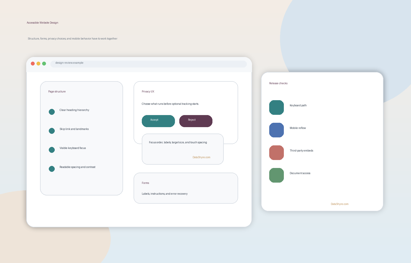
1. Start with the journeys that matter, not the prettiest page
The first accessible website design mistake is reviewing one polished marketing page and assuming the rest of the product is fine.
It rarely is.
ADA.gov’s current web guidance keeps pointing teams back to the same kinds of user tasks that break first: forms, navigation, media, and the information people need in order to use a service. So a useful accessible website design review should start with the real journeys:
- homepage and navigation;
- signup, login, and password reset;
- checkout, lead, support, or request forms;
- cookie banner and privacy-preferences flows;
- account settings and confirmation screens;
- downloads, videos, and embedded tools.
If those journeys are not accessible, the homepage polish does not matter much.
2. Treat keyboard flow and visible focus like core layout requirements
This is one of the clearest markers of serious accessible website design.
W3C’s current accessibility principles say all functionality should be available by keyboard and that keyboard focus should not get trapped. W3C’s Easy Checks guidance also still says accessible websites should let people reach links, forms, buttons, and media controls through the keyboard, and that focus should stay visible and follow a logical order.
That makes design questions operational:
- can people move through menus, cards, tabs, filters, and dialogs without a mouse;
- is the focus state obvious against the real color palette;
- does focus move in a sequence that matches the reading order;
- can people leave a modal, menu, or media component after entering it;
- do skip links, landmarks, and headings reduce friction on large pages.
If the visual system looks refined but the keyboard path feels random or trapped, the accessible website design work is not done.
3. Design forms for comprehension, not only for field completion
ADA.gov is still blunt about inaccessible forms.
Its current guidance says people may not be able to submit forms accurately without labels, clear instructions, and error indicators. The current Section508.gov web design guide adds another practical point: when errors are detected and known fixes exist, correction suggestions should be provided with the error notification.
For accessible website design, that means forms should be reviewed for:
- explicit labels that stay tied to each field;
- instructions that appear before the user fails;
- clear grouping for related fields;
- error messages that explain what to fix;
- confirmation states that do not rely on color alone;
- adequate spacing, sizing, and mobile usability.
This is especially important for privacy-request, support, checkout, and lead forms, because those are the places where a site can become both inaccessible and operationally risky at the same time.
4. Include consent banners and privacy controls in the design system
Many teams separate privacy UX from accessibility work.
That is a mistake.
In real deployments, accessible website design must include the same interfaces that decide whether someone can reject tracking, open preferences, or submit a rights request. W3C’s current guidance on keyboard access and input still maps directly to those patterns, and ADA.gov’s form guidance applies there too.
So review privacy components like real product components:
- can
Accept,Reject, andManageall be reached and activated by keyboard; - is the active control visibly distinct on mobile and desktop;
- do toggles expose their state clearly;
- can a screen-reader user understand what each category does;
- does the interface avoid color-only cues or tiny tap targets;
- can the user leave the dialog without getting trapped.
If your banner copy is legally tidy but the interaction is frustrating or inaccessible, the accessible website design layer is weaker than it looks.
5. Design for mobile reflow, zoom, and modern input modes early
W3C’s current principles keep emphasizing that accessibility is not only about traditional desktop keyboard use. The guidance specifically notes input modalities beyond keyboard, including touch and voice, and says the same design work applies across mobile phones and tablets.
That matters because a lot of accessible website design issues show up only when the layout gets tight:
- headings wrap awkwardly and lose hierarchy;
- focus rings disappear against sticky elements;
- consent buttons collapse into cramped stacks;
- touch targets become too small;
- dialogs or drawers obscure the content that triggered them;
- zoom creates horizontal scrolling or clipped controls.
This is also where WCAG 2.2 becomes useful as a design target. Its newer success criteria include focus visibility, target size, redundant entry, and accessible authentication. Even where policy still cites older versions, those are practical design upgrades worth adopting now.
6. Treat documents, media, and third-party tools as part of the same experience
A lot of accessible website design programs fail at the edges.
The public site may improve, while the PDF download, calendar embed, chat widget, video player, CAPTCHA, or payment step still blocks users. Section508.gov’s guidance keeps reinforcing that accessible digital products involve designers, content creators, and developers together, not just one team fixing a template in isolation. ADA.gov’s state-and-local-government first-steps guidance also makes the third-party point directly: if a public entity relies on an outside service, it still needs that service to be accessible.
So a real accessible website design review should include:
- PDFs and downloadable documents;
- captions and transcripts where needed;
- alt text for diagrams and instructional images;
- booking, payment, support, and map embeds;
- CAPTCHA or verification steps;
- accessibility feedback paths for users who hit trouble.
This is often where the prettiest design system quietly hands control back to inaccessible third-party components.
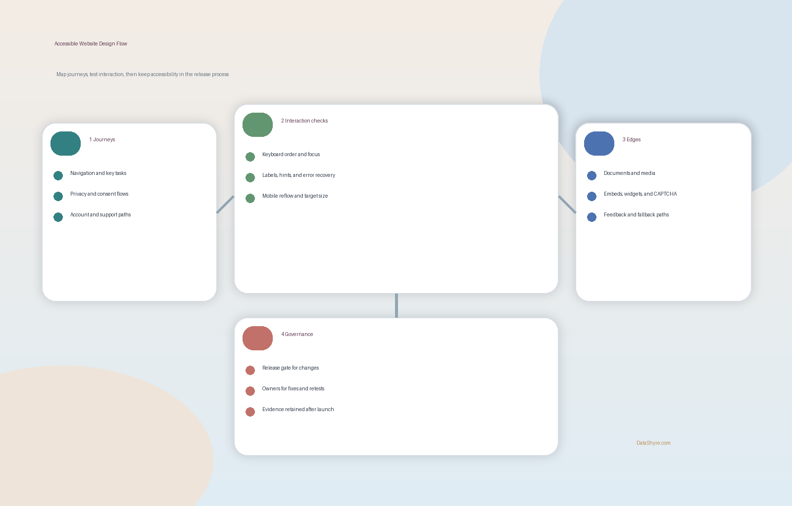
7. Make accessible website design part of release governance
The long-term risk is drift.
W3C’s WCAG 2.2 materials are explicit that the supporting documents are meant to help authors develop and evaluate content with current technologies. ADA.gov’s current rule resources also show that obligations and deadlines can change by entity type and audience. For state and local governments, the Department’s current first-steps page says the compliance deadlines are now April 26, 2027 for public entities with populations of 50,000 or more and April 26, 2028 for smaller public entities and special district governments after the April 2026 interim final rule.
So the durable version of accessible website design is a release process:
- review components before launch;
- test keyboard flow and visible focus on real journeys;
- retest forms, dialogs, and privacy controls after copy or layout changes;
- review embedded vendors before adding them to production;
- document known limitations and feedback channels;
- keep evidence of what was tested and when.
Without that discipline, accessibility becomes a point-in-time promise rather than a maintained capability.
A practical accessible website design review for this week
If you were reviewing accessible website design on a live site this week, use this order:
- pick the five journeys that matter most to users and the business;
- test them keyboard-only with the mouse put away;
- inspect forms for labels, instructions, error recovery, and confirmation clarity;
- test consent banners, preference centers, and privacy-request flows like first-class UI components;
- force mobile widths, zoom, and touch-heavy interaction;
- review documents, media, and third-party tools in the same pass;
- add the checks to the release process so the fixes hold.
That order usually surfaces more truth than another broad accessibility statement with no runtime proof behind it.
FAQ
Is accessible website design just a front-end styling issue?
No. Accessible website design includes structure, interaction flow, forms, error handling, documents, media, third-party tools, and the operational process that keeps those pieces working after launch.
Does accessible website design include cookie banners and privacy flows?
Yes. If users cannot refuse tracking, manage preferences, or submit privacy requests with keyboard, screen reader, zoom, or touch input, that is both an accessibility and compliance problem.
Should teams still target WCAG 2.2 if a rule or contract mentions an older version?
The fastest way to judge accessible website design is to test it the way a broken deployment would expose it: before consent, after consent, and again after a stack change.
Official sources used
- ADA.gov: Guidance on Web Accessibility and the ADA
- ADA.gov: State and Local Governments First Steps for the Title II Web and Mobile Rule
- W3C: Web Content Accessibility Guidelines (WCAG) 2.2
- W3C WAI: Accessibility Principles
- W3C WAI: Easy Checks – A First Review of Web Accessibility
- Section508.gov: Guide to Accessible Web Design & Development