Privacy Banner in 2026: 7 Live Checks Before You Trust One
The real value in privacy banner shows up when you debug it like a live system. A banner can render perfectly and still leak requests, misfire tags, or drift after the next plugin or theme update.
The useful test for privacy banner is whether the live stack behaves correctly before consent, after consent, and after the next deployment. That is how hidden leaks and timing mistakes show up.
That distinction matters now because the live official guidance is pushing teams toward real controls instead of cosmetic notices. The ICO’s finalized storage-and-access guidance says the consent mechanism should make refusal “as easy to refuse consent as it is to accept” and that withdrawal must work with the “same ease that they gave it.” France’s CNIL still says “rejecting cookies should be just as easy as accepting them.” Google’s current tag guidance still says default consent states belong on the page “before any commands that send measurement data.” California’s Department of Justice still says a valid Global Privacy Control request “must be honored.” And CalPrivacy’s March 5, 2026 Ford enforcement statement put the operational point plainly: “Opting out is supposed to be easy.”
That means a strong privacy banner is not just a box with brand-safe copy.
It is the front door to a control system that has to:
- tell people what kind of choice they are making;
- separate consent from sale-or-sharing opt-out where needed;
- control tags, pixels, embeds, and storage in the runtime;
- provide a return path for changes later; and
- leave behind evidence your team can still trust after the next release.
If you want the closest companion reads first, start with these guides to cookie notice, cookie banner examples, and cookie preferences. This page stays broader than banner copy alone. It is the privacy banner review I would use this week before approving a redesign, a CMP rollout, or a policy refresh.
If your team is trying to get privacy banner under control without adding a heavyweight privacy stack, DataShyre can help. DataShyre focuses on consent and preference management that are easier to implement, easier to operate, and easier to trust on a live site. Start with DataShyre’s consent and preference management or book a demo.
If your team is comparing OneTrust, Cookiebot, CookieYes, or a lighter in-house build, DataShyre can help connect the banner layer to GTM behavior, policy text, consent records, and California branching so the live site matches what the banner promises.
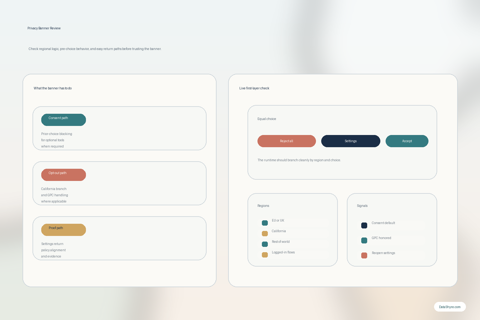
1. Decide whether the banner is collecting consent, handling opt-out, or trying to do both
The first privacy banner mistake is acting like every jurisdiction needs the same first-layer logic.
It does not.
For many EU and UK flows, the live question is whether non-essential storage or access technologies stay off until the visitor gives valid consent. For California flows, the live question may turn on notice, sale-or-sharing opt-out, and whether Global Privacy Control is recognized and honored.
So before you rewrite or replace a privacy banner, define:
- which markets the site actually serves;
- which templates or subdomains differ by region;
- which technologies require prior-consent behavior;
- which data flows trigger sale-or-sharing concerns; and
- whether the site needs more than one rights path.
If you skip that step, the banner may look polished while quietly mixing together legal jobs that should stay separate.
2. Test the no-choice state before you test acceptance
This is still the fastest technical check.
Google’s current setup guidance says default consent states should be applied “before any commands that send measurement data.” The ICO’s 2026 storage-and-access guidance matters here too because it covers cookies, tracking pixels, device fingerprinting, and related technologies more broadly, not only classic cookie tables.
So a serious privacy banner review starts in a clean browser session:
- open the page with no prior choice;
- inspect requests, cookies, local storage, and embeds;
- navigate once without interacting;
- test
Reject all; - test
Accept all; and - reopen settings later and change the choice.
Then verify what actually happened:
- optional technologies stayed off before the user chose;
- consent defaults reached the tag layer early enough;
- embeds, chat tools, maps, or video frames did not quietly bypass the banner;
- mobile and desktop behave the same way; and
- the second page view does not ignore the first choice.
If the no-choice state already leaks optional tracking, the privacy banner is performing design, not control.
3. Make refusal as visible as acceptance
This is now the quickest human check.
The ICO says consent mechanisms should make it “as easy to refuse consent as it is to accept.” CNIL says “rejecting cookies should be just as easy as accepting them.” That pushes good privacy banner design toward equal first-layer usability rather than persuasive detours.
For a live review, compare:
- whether
Reject allis present whereAccept allis present; - whether both are equally readable on small screens;
- whether color, placement, and button weight bias one path;
- whether refusal takes extra clicks or hidden text links; and
- whether the settings route feels like a real choice rather than a delay tactic.
If refusal exists only in theory, the banner may still fail the boring real-world test that matters most: can a normal visitor say no without hunting for it.
4. Keep purpose labels and policy links honest
A privacy banner becomes risky when the words on screen drift away from the live stack.
People need to understand what they are choosing between. Your privacy and cookie pages also need to describe the same system the banner controls.
That means the better privacy banner is the one whose categories still make sense when you compare them against:
- GTM or direct tag configuration;
- analytics and advertising tools;
- session replay, chat, booking, or testing tools;
- embedded video or maps;
- vendor disclosures; and
- the return path for changing a choice later.
Vague labels like improve experience or partners often sound smoother than they read. If a category hides what actually happens, the banner is doing branding work, not disclosure work.
5. Separate California opt-out handling from consent language
This is where many privacy banner implementations still blur the lines.
California’s DOJ says a qualifying GPC request “must be honored” by covered businesses as a valid request to stop the sale or sharing of personal information. CalPrivacy’s Ford enforcement statement in March 2026 also emphasized that “Opting out is supposed to be easy.”
So if your site has a California branch, a serious privacy banner review should ask:
- does the site detect and honor GPC where applicable;
- does the interface confirm the opt-out state in a usable way;
- are California controls hidden inside EU-style consent wording;
- does the runtime change downstream sharing behavior when the opt-out applies; and
- can the team explain how the California branch differs from prior-consent regions.
This is one reason global banners go wrong. They often reuse one visual component everywhere while the legal and runtime behavior underneath should fork much earlier.
6. Make the return path and withdrawal path boringly easy
A privacy banner is not only a first-visit moment.
The ICO’s current guidance says withdrawal should work with the “same ease that they gave it.” That means the live review cannot stop after the first click.
Test whether the site gives people a practical way to:
- reopen preferences from the footer, policy page, account area, or another durable location;
- move from granted to denied without friction;
- change granular settings after the initial visit;
- have those changes reflected in real behavior, not just in stored preferences; and
- understand what changed.
If the return path is buried, broken, or disconnected from the runtime, the privacy banner is incomplete even if the launch-day experience looked clean.
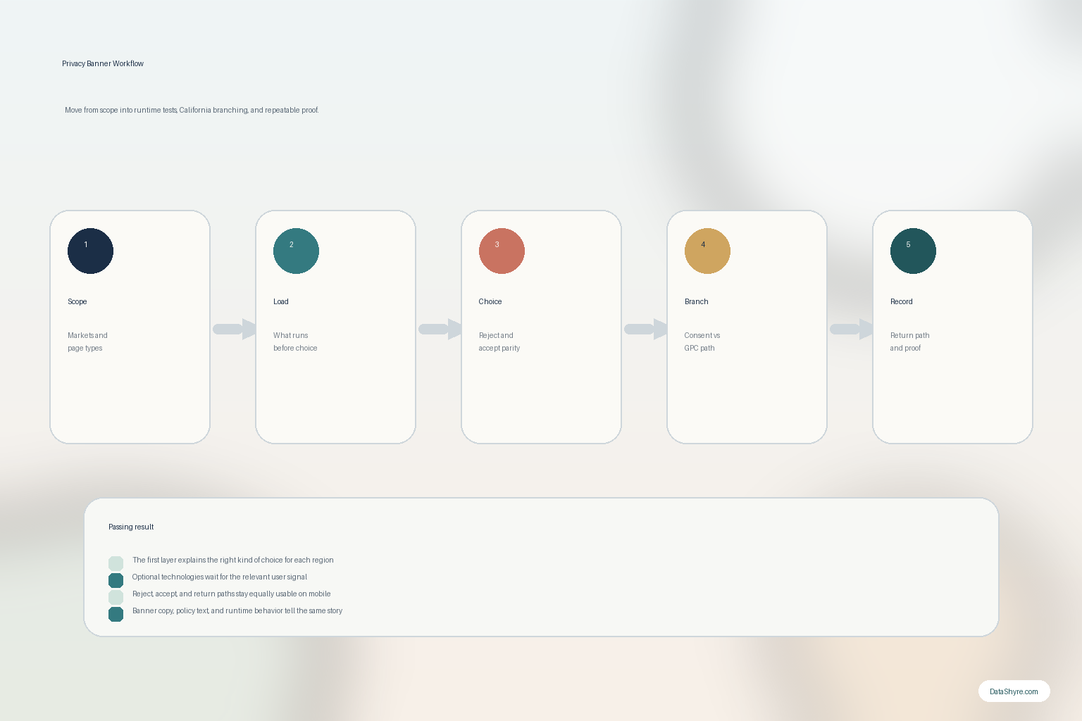
7. Save proof and re-test after releases
The long-term privacy banner problem is usually drift.
A new tag, a new embed, a new ad platform setting, a plugin update, or a rushed GTM publish can break the privacy story without anyone touching the banner copy.
So a strong privacy banner program keeps proof of:
- what the first layer looked like at the time;
- what purposes and categories were offered;
- what the user chose;
- how the runtime behaved for that choice; and
- what changed after later releases.
That is also the point where outside implementation help often pays for itself. DataShyre can help teams turn a banner project into an auditable runtime control instead of a one-time design task.
A practical privacy banner review for this week
If you were reviewing a privacy banner today, use this order:
- define the regional jobs the banner has to perform;
- test the no-choice state in a clean browser;
- compare accept and reject friction on desktop and mobile;
- map the banner labels to the live tools and disclosures;
- test the California branch and GPC handling where relevant;
- reopen settings and withdraw later; and
- re-run the test after the next tag, plugin, or vendor change.
That sequence usually tells you more than a feature checklist or a legal-template review.
FAQ
Is a privacy banner the same as a cookie banner?
Often the terms overlap, but privacy banner is broader in practice. Teams sometimes use it for the whole front-door privacy-choice layer, including consent, opt-out, and return-path controls.
Can one privacy banner handle both EU and California expectations?
Sometimes, but only if the implementation clearly separates the jobs being done. The same visual shell can sit on top of different regional logic, but the logic itself should not be blurred together.
Is a privacy banner enough by itself?
No. A privacy banner only works if the underlying tags, pixels, embeds, notices, and rights flows follow the same rules the banner describes.
Bottom line
The best privacy banner in 2026 is not the one with the prettiest buttons.
It is the one that makes the right kind of choice clear, keeps the runtime aligned with that choice, handles California and consent-heavy regions honestly, and leaves behind proof your team can still trust later.
The fastest way to judge privacy banner is to test it the way a broken deployment would expose it: before consent, after consent, and again after a stack change.
Sources
- ICO: Guidance on the use of storage and access technologies
- ICO: How do we manage consent in practice?
- ICO: Final storage and access technologies guidance published (April 29, 2026)
- CNIL: Dark Patterns in Cookie Banners
- Google for Developers: Set up consent mode on websites
- California DOJ: California Consumer Privacy Act (CCPA)
- CalPrivacy: Ford to Change Practices, Pay Fine for Adding Unnecessary Friction to Opt-Out Process